First response: formal elements
To begin my work on my landscape photography I decided to look at different areas that represent different atmospheres. For example my work in the cemetery which represents death and sadness or my work in areas such as the woods which too many can represent family gatherings, sports and fun!
1st Response - Allotment
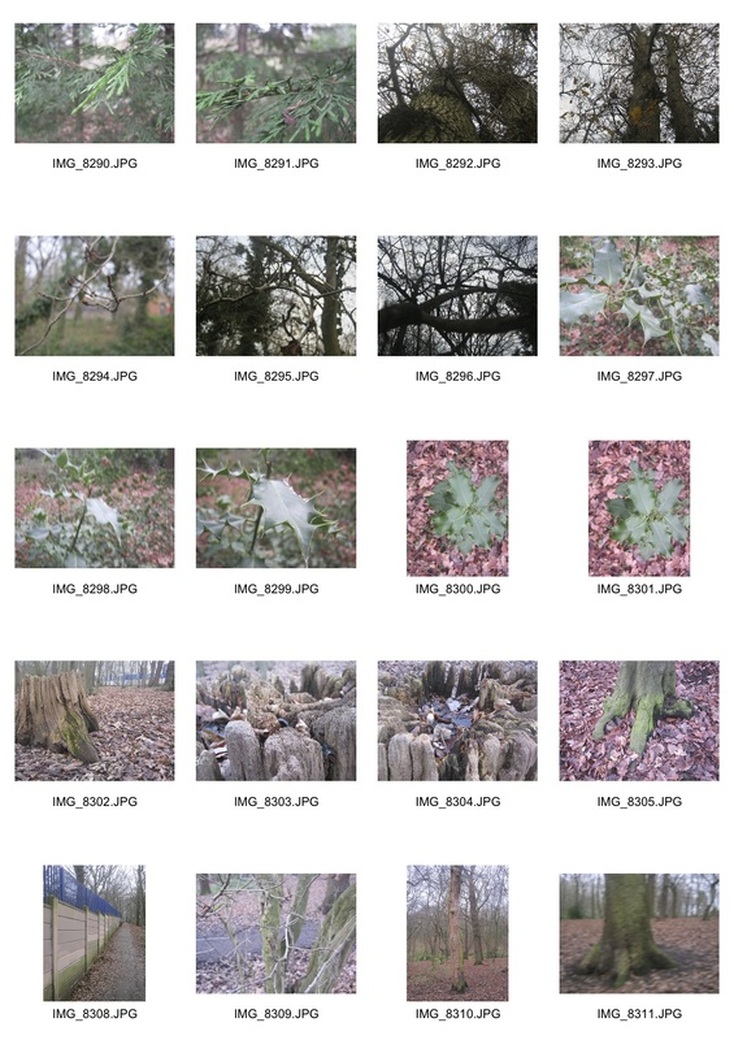
2nd Response - Woods
PerspectiveWhen focusing on perspective I focused mainly on the bench and a few leaves shown above. This bench worked well as it was quite long meaning one end could be more in focus than the other allowing the back of the images to lose focus!
|
PatternFor my patterns I looked primarily at patterns within trees. This is because the details on trees can be very intriguing representing its age but also trees closely positioned can create illusions in the depth of field.
|
LayersFor my layers work i focused on the chair and logs shown above. My favourite however is the logs photograph as I reckon this shows more layers with each log able to represent the change in focus from the foreground to the background!
|
TextureHere shows my texture section. I decided to focus mainly on the leaves from the tree picking up very little details for each of the strands of leaf hanging off it. My favourite is probably the image of the holly as it shows very fine details and preserves focal balance.
|
ColourI also looked at Colour for one of my themes. For this i focused mainly on the chair as compared to its surroundings the blue particularly stood out. This worked very nicely as the light was able to bring out the colours best creating a real difference between the chair and its surroundings but also preserving its look of wear.
|
ContrastFinally contrast was my last section. For this I looked at the table above. This worked very well with the old rusty table being associated to the modern building but also there is a big focal change throughout the image. The middel is most in focus and the front and back the least therefore making this a succes!
|
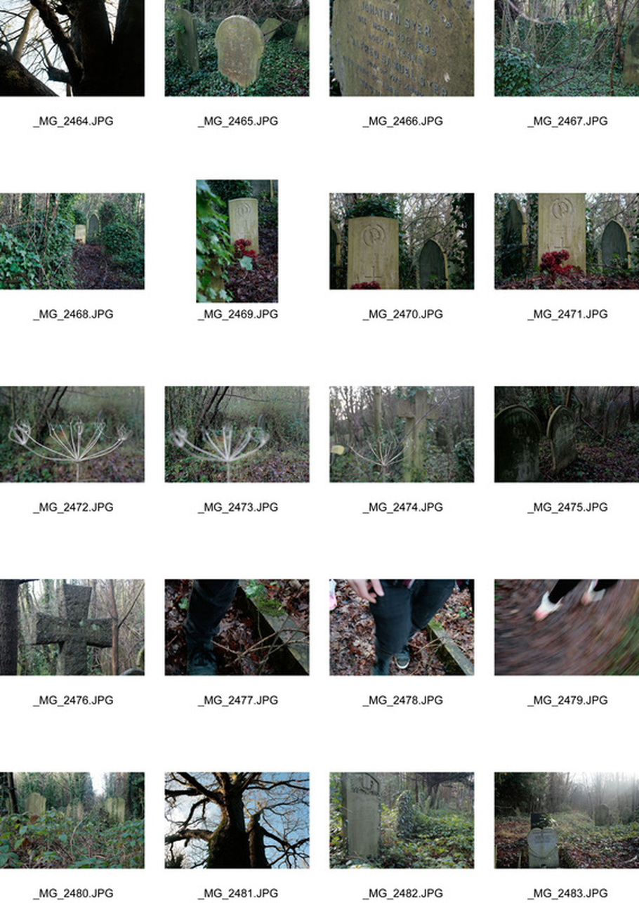
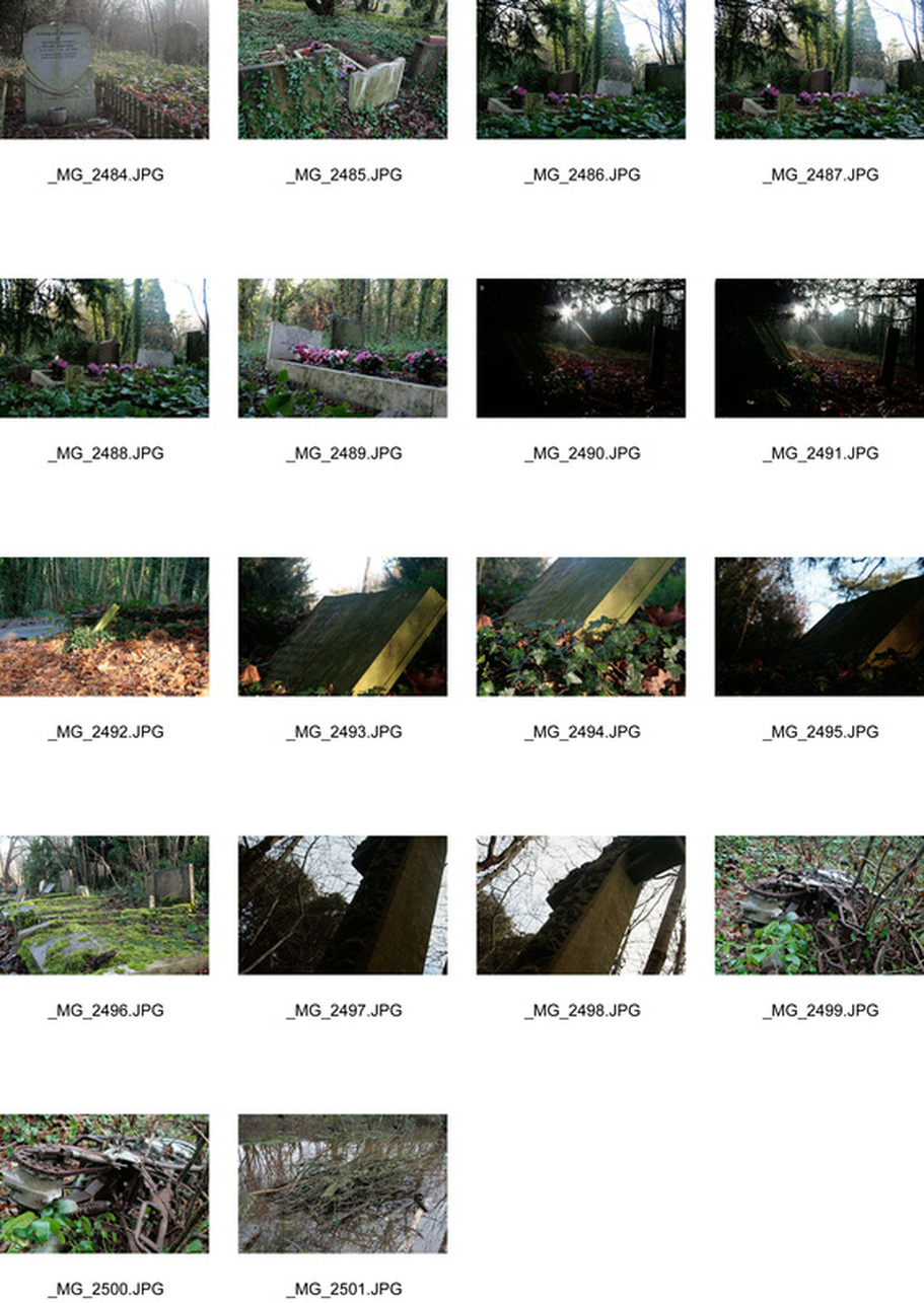
3rd Response - Cemetery
|
|
Allotment - Woods - Allotment
Through my photography shown above I have been able to develop my understanding for what I would like to focus on in my landscape project! These different places represent different moods and different atmospheres are present in each one. For example the woods had a bright atmosphere with different families exploring the different areas of the woods whereas the allotment had a very quiet almost derelict atmosphere and the cemetery held a sad and spooky atmosphere. The atmosphere is particularly brought out by the features of objects within the images. For example shown directly above is a grave stone. these are found in cemeteries and when many are positioned very close together as shown above can represent a high amount of death in one area and the dead abandoned flowers and dull coloured leaves really assist this feel of lifelessness!
Artist Analysis
Nadav Kander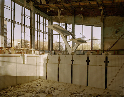
This image is by Nadav Kander and shows a swimming pool in Chernobyl after the Chernobyl crisis. The photographer took many images in Chernobyl however this particularly stood out against the rest to me due to the subject of the image. This image shows a swimming pool in Chernobyl and therefore due to the fact that it is deserted demonstrates the ghost town affect in Chenobyl as it is a very quite and empty place. The pool allows this to work particularly well as our usual interpretation of a swimming pool is a very busy and crowded/lively place. The photo is taken from inside the swimming pool looking up to the diving board and further out of the windows. The artist has purposely de-saturated the colours in this image to further the sense of of how the surroundings are empty and lifeless.
|
Nadav Kander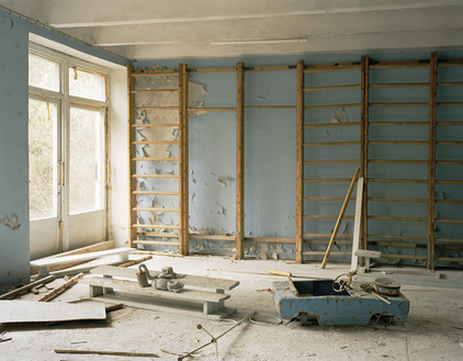
This photo by Nadav Kander shows an image of a deserted apartment in Chernobyl. This image shows desaturated blue colours on the walls of the apartment as well as on the toy car. These desaturated colours represent the desertion and lack of life in Chernobyl. The light in the photo comes mainly in via the window therefore balancing the image with the right hand side of the image showing the blue coloured walls and car. The peeling walls (back left), the broken climbing frame and the broken bits of wood in the bottom left of the photo all represent the context of the image.
|
Eugene Richards
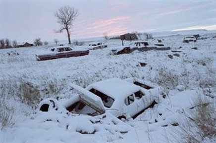
This is a photo by Eugene Richards and shows a wasteland of old cars. This image uses the abandoned cars to create a sense of desertion. The broken up and deserted cars create a lifeless feel to the image which is assisted by the low skyline as this adds to the derelict feel of the image. The limited colour scheme also creates a dull atmosphere a swell as the stand alone tree which furthers the feel of a derelict and abandoned area.
|
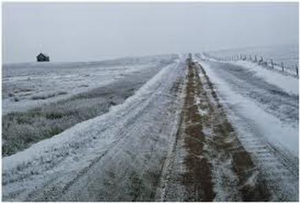
This shows another image by Eugene Richards showing an empty road. Most noticeably the house on the left hand side creates a real derelict and lifeless feel. This is mainly because the house seems totally alone amongst a wide field and the road shows no other cars passing by and is iced over as if it isn't used by many. The snow and ice also help create a derelict feel as it overpowers the life in the image. The photographer here has purposely picked a very flat area to show lifelessness and the house in this image is used as a example of isolation.
|
Nadav Kander/ Eugene Richards based project
Here shows my response to Nadav Kander and Eugene Richards work. This location shown above suits this photography very well. like Nadav Kander I have purposely picked a public like place which one would expect to see busy - a swimming pool. Not only this but like Eugene richards work this pool is frozen over therefore using the idea of ice and snow to overpower the potential life such as grass and plants.This project worked particularly welland the pictures above really seem to create similar affects to those of Kander and Richards.With key elements such as the frozen water, dead frozen plants and abandoned footballs and tyres creating a derelict style set.
Landscape: My London
After looking at the isolated and derelict areas in london I decided to stick to exploration of atmospheres however instead I looked at the opposite of isolation. London has a population of over 8 million and therefore there tend to be many entertainment events mainly sports were many people gather in crowds. i decided i wanted to try and present the potential busyness of london. Below shows my first artist analysis into these areas.
Andreas Gursky
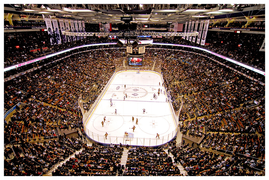
This image by Andreas Gursky shows a Canadian hockey match. Here the photographer has taken the image from a significant height. This results in a loss of distinction between members of the crowd therefore creating a very busy effect to the image. The centre of the image is the hockey pitch which is the most outstanding part of the image as it is brighter than its surroundings. This comes out on the crowd as some of the light brightens the crowd who are nearest to the pitch however as the crowd continues around the stadium it becomes less impact full due to the lower light levels. Here the photographer has used composition to centre the pitch however this also results in a very long perspective as the crowd at the back of the image is very far away from the photographer. In turn this bur between the different individuals and the wide-angle used creates a very busy image representing a lot off different types of people.
Ronaldo Fonseca
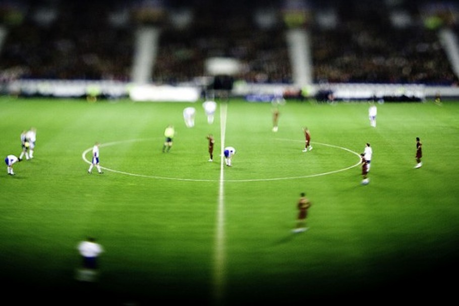
This image is by Ronaldo Fonseca and shows a football playing field whilst players are engaging in the game of football. This image uses a very small focal length therefore making the players seem a lot smaller and unrealistic than they indeed are. To counter the lack in focus Fonseca has made sure the colours are very vibrant such as the green playing field and the colours of the referees and players shirts. The perspective and depth of field in this image are therefore very small with the crowd at the back of the image being totally out of focus and the area nearest to the photographer being very dark. The composition of the image results in the centre line being right in the middle of the photo. This in particular helps to show the depth of the image but also the focal length creating alignment with the pitch. This football field photography is an area that really interests me as many different types of atmospheres can be associated with a football game.
Ian Payne
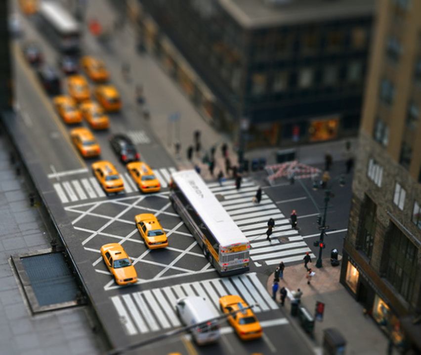
This image has been taken in New York by Ian Payne. This is represented by the yellow taxis along with the typical look of a street in New York being represented in this image. Here the photographer has used a tilt shift affect to the image to make the people and cars almost seem like models. This works particularly well due to the many different colours in the image such as the yellow cars and the light on the back of the bus. The tilt shift works noticeably well due to the height in which the image is taken as this allows many vehicles and pedestrians to be involved in the photo as well as different scenarios and colours. For example you have people crossing the road, road works being sectioned off in red by the crossing as well as cars moving up he main road. All of this creates a good busy setting for a tilt shift image.
First attempt: My London
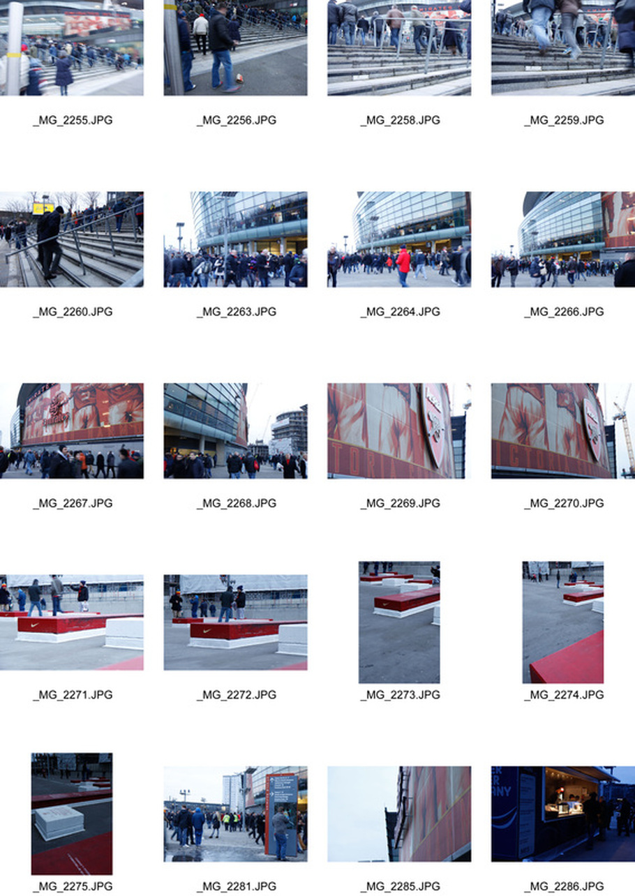
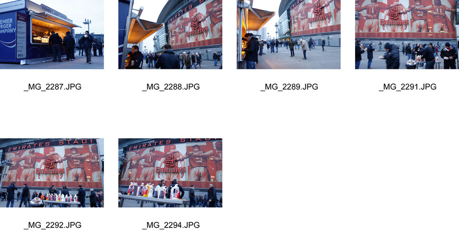
Above are my contact sheets from my trip to the Arsenal stadium as part of My London project. I went out and took mainly photos of the outside of the stadium to demonstrate the busyness of my london.
Editing
Below shows different ways in which to edit images. I went to different extremes in saturation as my artist research helped me recognise that when taking images of crowds in landscape photography different vibrance of colours can change an atmosphere entirely.
This shows the highest extremes of the editing process for these images. I went through this process with majority of my images to bring out the colours of the stadium in contrast the the items around it. this included altering the saturation for individual colour by deselecting and selecting parts of the photograph as well as altering the brightness in different areas of the images. The videos above show the very basics to these techniques however I did go into more detail when editing as practice for my tilt shift photography shown later on.
Finals
These images show my final outcome of my first response to my research. For this response I decided to focus on the type of settings that represent my London before starting the tilt shift element of my project. On my trip to the emirates stadium I took images such as that of the stairs representing movement and others of the stadium to find different colours i could use in my tilt shift piece. I used this project to prepare for my later tilt shift images to find areas of the venue that I could use. from this project I decided that for a successful tilt shift style image strong amounts of colour is required to counter the fact that much of the image is out of focus.
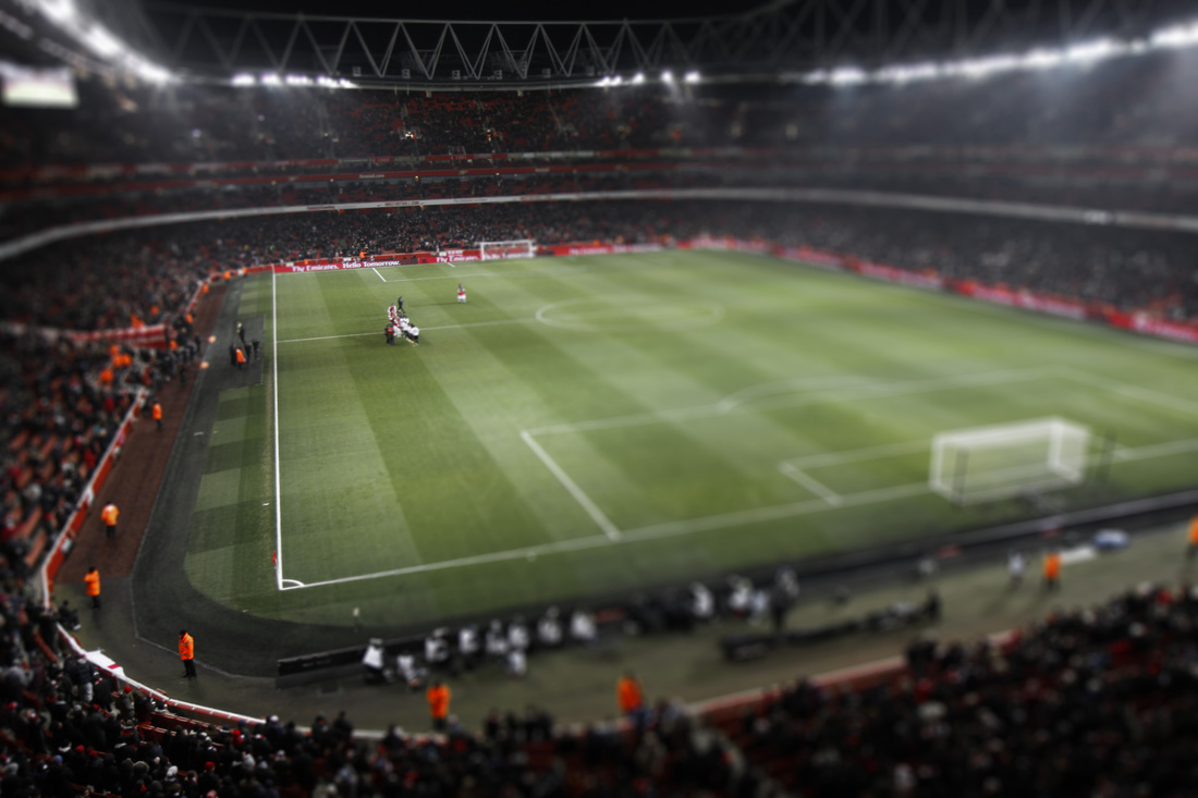
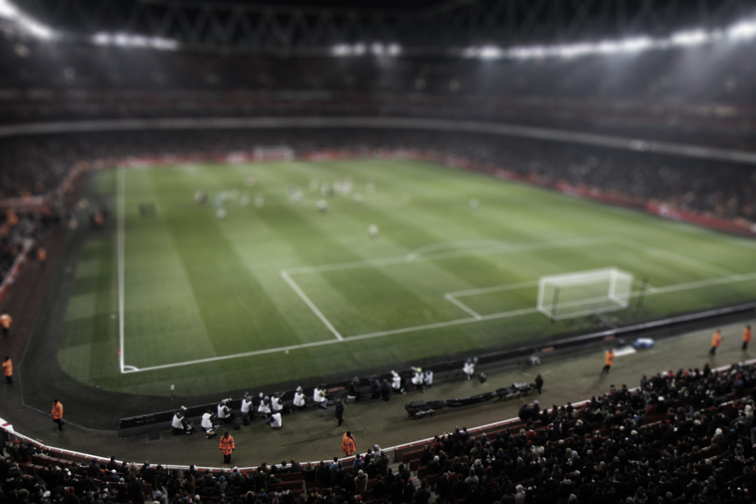
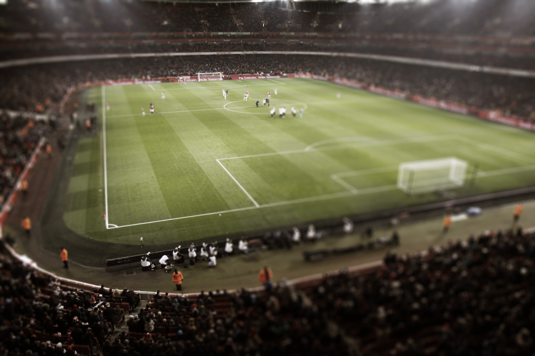
Tilt Shift
After looking over the images from my first project and referring back to my artists. I decided to focus mainly within the emirates stadium as the pitch creates a lot of colour and vibrance particularly during a evening match due to the contrast between the sky and the pitch. Below show my contact sheets from my tilt shift project and my second shoot.
Tilt Shift Tutorial Video
After taking my images I decided to do some research into techniques on photoshop for creating the tilt shift style effect. This consisted of using gradient tools and then changing the levels of blur and focal length for each of the selected images.
After looking at these tilt shift tutorial videos I went ahead and started to create my own tilt shift photography using these photoshop techniques. Below show the results of this experimentation.
Here shows my final four tilt shift images from my contact sheet. I used the lens blur and gradient tool to change the individual images to different focal lengths and then changed the saturation of the images. I have shown different approaches to each of these images shown below using different levels of blur and saturation!
1
2
3
4
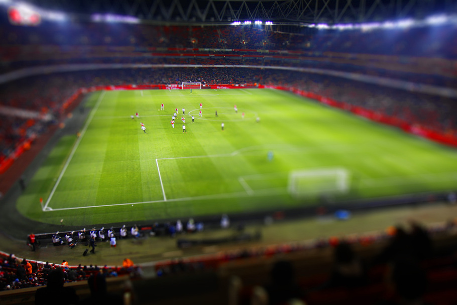
Above shows my first response to my tilt shift research. Here I used the Emriates stadium interior as my scene taking pictures of different moments in the game. I presented them in four different ways as I found from earlier resarch shown before such as the work of Ronaldo Foncesca which showed to me that depending on the light and vibrance of the colours within a tilt shift image, this can change the atmosphere and connotations attached to it. I created one very vibrant image shown above. This really enhanced areas such as the red borders and the green football pitch as well as the big floodlights which is very impact full at lighting up the pitch. On the other hand other images of mine show a darker and less saturated effect. This therefore makes the image seem old and takes away the modern feel to the image changing the connotations of the atmosphere within the ground. These images therefore are successful in using different saturations and levels of tilt-shift to create different atmospheres.
Archway Bridge
After using my technique on the emirates stadium I decided to further my experiments and look into using the same technique on a bridge. i chose Archway bridge and North Finchley bridge to do this experiment.
North Finchley Bridge
Tilt-Shift(ed) Images
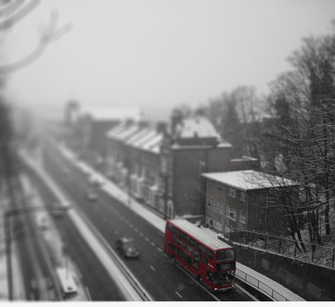
Above show the finals from my bridge tilt-shifted images. Both bridges have created a different affect. Archway bridge shown higher up has created a much more high angle result were as the bridge shown lower down has created a closer image to the subject. The tilt shift however appears to have been more successful from the higher angles as from the lower angles the tilt shift is seems effective at creating model like images but instead seems to create different levels of blur.
This image in particular (below) stood out to me the most. Here i feel the tilt shift affect has been relatively successful. The red bus in particular makes this image much more intriguing adding colour to what appears to be a very snowy and dull background. The tilt shift itself has worked relatively well in this image to create different levels of blur to distort the true size of the objects. This therefore feels like a success as this image is a result i was looking for. It seems as if i have learnt that to make tilt shift work the best a high angle shot is best to use this affect on.
HDR Research - Matej Toman
This photographer uses HDR to enhance his images. From my research I found HDR takes three different photos at the same time at different exposures and then merges them to create a highly detailed image. Here Toman has used this technique on racing drivers to create high detail amongst the track and the movement. The first image for example shows a racer on a dirt track. However the HDR manages to pick up small details such as the sand being picked up but laso enhance the image such as the yellow top. On the other hand the second image shows an off-road biker. This image uses HDR effectively as areas such as the tree leaves and biker outfit are greatly enhanced creating a very wide colour scheme in the photo. This is something i would like to bring across in my photography.
Lance Craig
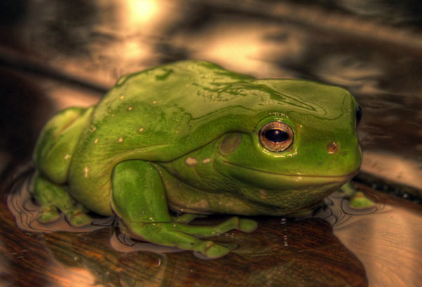
Lance Craig is another HDR photographer. Above shows one of his images which focuses on a much smaller subject. A frog in this instance is shown in the above image. In this case the HDR effect really enhances he reflections of the water on the frog and the green coloured skin is also very vibrant due to the HDR application. Noticeably areas around the feet were the water ripples is also very detailed and represents the full effects of a HDR image. This shows exactly the highest quality of a full HDR photo and is very helpful to look at when trying to create my own.
HDR
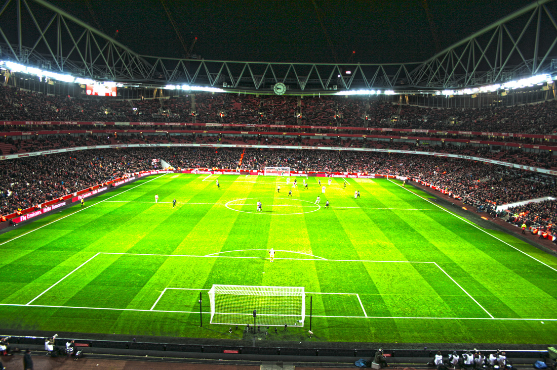
Here shows the outcome of my HDR project. This shows the Emirates photo having been used to create the HDR effect. Overall this image appears to have worked in enhancing the details of the image. For example the pitch and the lines have been very clearly identified by using this technique. On the other hand the netting of the goal has also become more visible. This therefore suggests this technique has worked however only to a partial degree. This is because the image does appear, in areas, to seem rather too bright. For example mainly areas on the pitch itself do appear to be very over saturated. It seems in conclusion my attempts at HDR have been a relative succes.
After looking into HDR I have come to the conclusion that I would like to change my idea. instead of using HDR to represent my images I have decided i would like to use a type of video.
Pic Motion/Time lapse
Here show different videos representing different time lapse videos and pic motion styles. In particular the 1st one over a bridge and the last one n the Emirates particularly caught my eye. I have decided this is something i would like to do as part of my final piece as I am very keen on creating a type of video that fits my topic! The bottom video in particular showing the Emirates stadium is one that interests me most. I have decided i would like to do a very similar project however reduce the level of camera shake and create a much more professional outcome.
Final
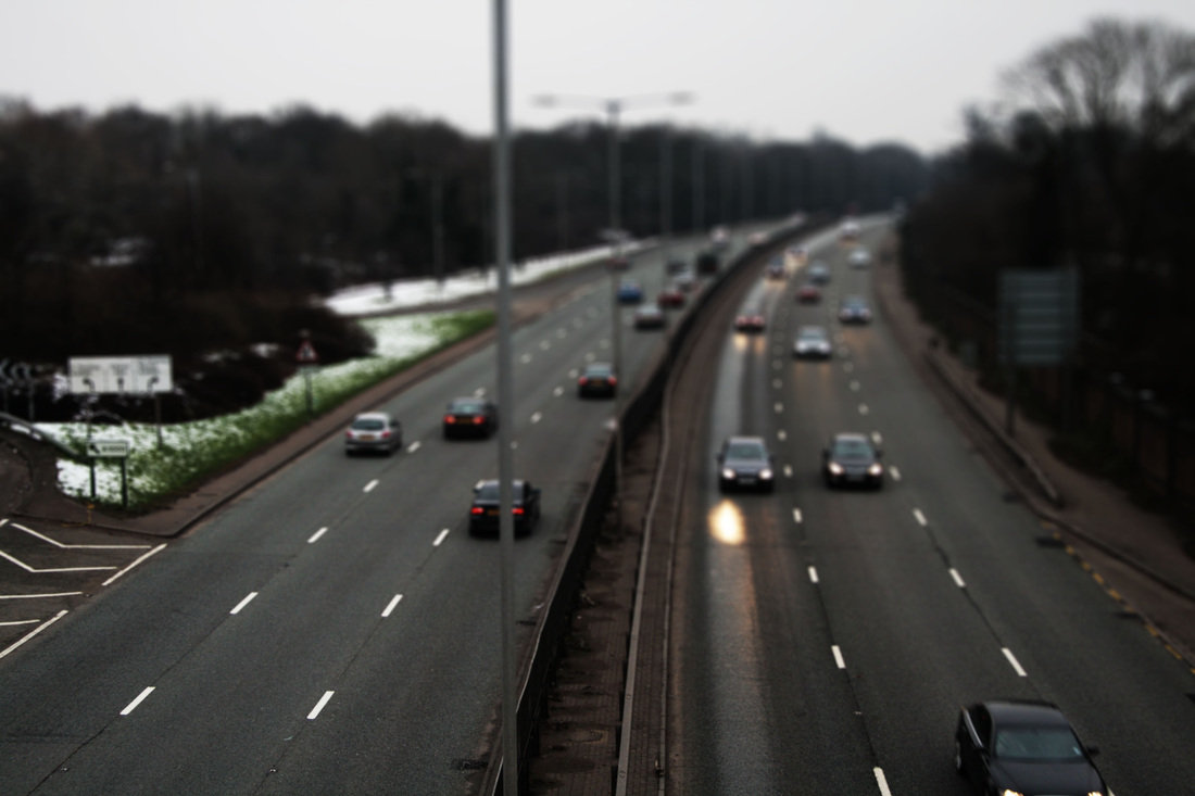
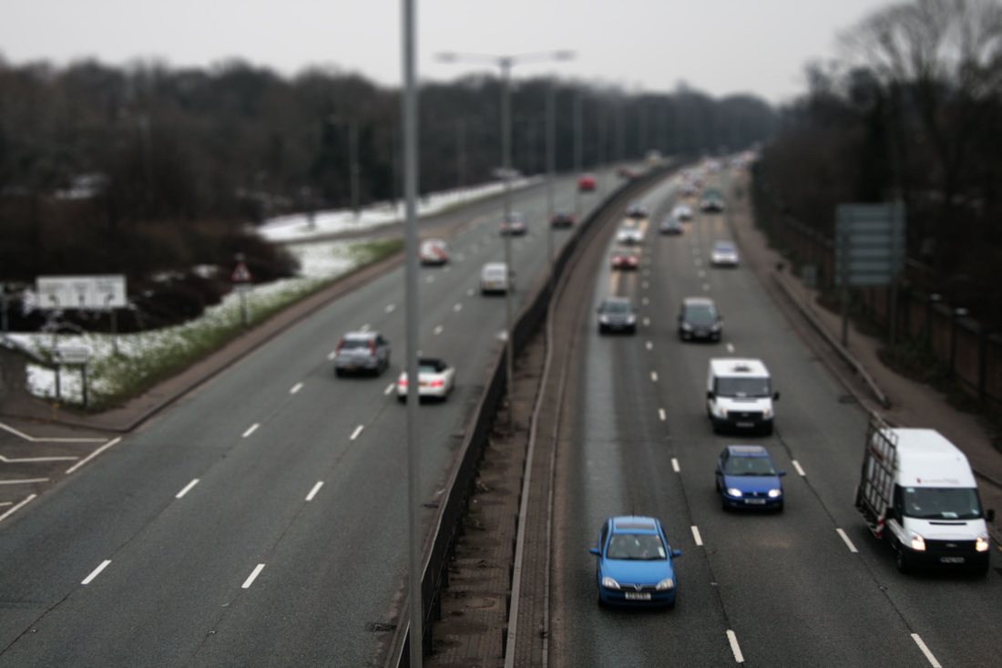
Here shows my first attempt at my final piece. For this i used a bridge near Brent Cross a very busy area and a major shopping center. I positioned my tripod down the centre of the road to have the cars either side travelling up and down the road. This was my first attempt which I was lees impressed with as I struggled to get the correct timings between each image. Therefore in some areas it jumps and stutters which can be displeasing to the eye. However this I was very pleased with the scenery as i thought the location was very appropriate. I used this video to analyse before starting on my final piece video shown below. I wanted to ensure that I could fix any errors to do with stutter or even location and the type of place in which to do these videos!
Here shows my final piece for my landscape project. I took the idea of using the Emirates stadium from my tilt shift images and instead after looking at other videos on the internent applied it to a pic motions video. Above is my result! It shows the Emirates stadium filling up pre-game as the crowd come in from the entrances to fill up the seats. This worked particularly well due to the good light and business of the game. i positioned my camera right in the centre of the crowd looking down the middle of the pitch. I then took around 400-600 photographs and assembled them into a time lapse using an application. I purposely made the video quite short as I wanted maximum quality and for the viewer to be able to properly identify what is moving on the pitch and in the crowds! This video was therefore a huge personal success - it really shows a proper fully functioanl, non-stutter time lapse. The light is balanced and the crowd and players are visible therefore creating a very pleasant viewing experience!
